Charter Communications
Despite being one of the largest cable providers in the country, Charter had been licensing a typeface that was used to display information on-screen for every customer. It was a costly approach with many drawbacks, so they turned to Ebb+Flow to create a typeface they could own. While typefaces are things most designers and companies take for granted, creating one is a massive undertaking.
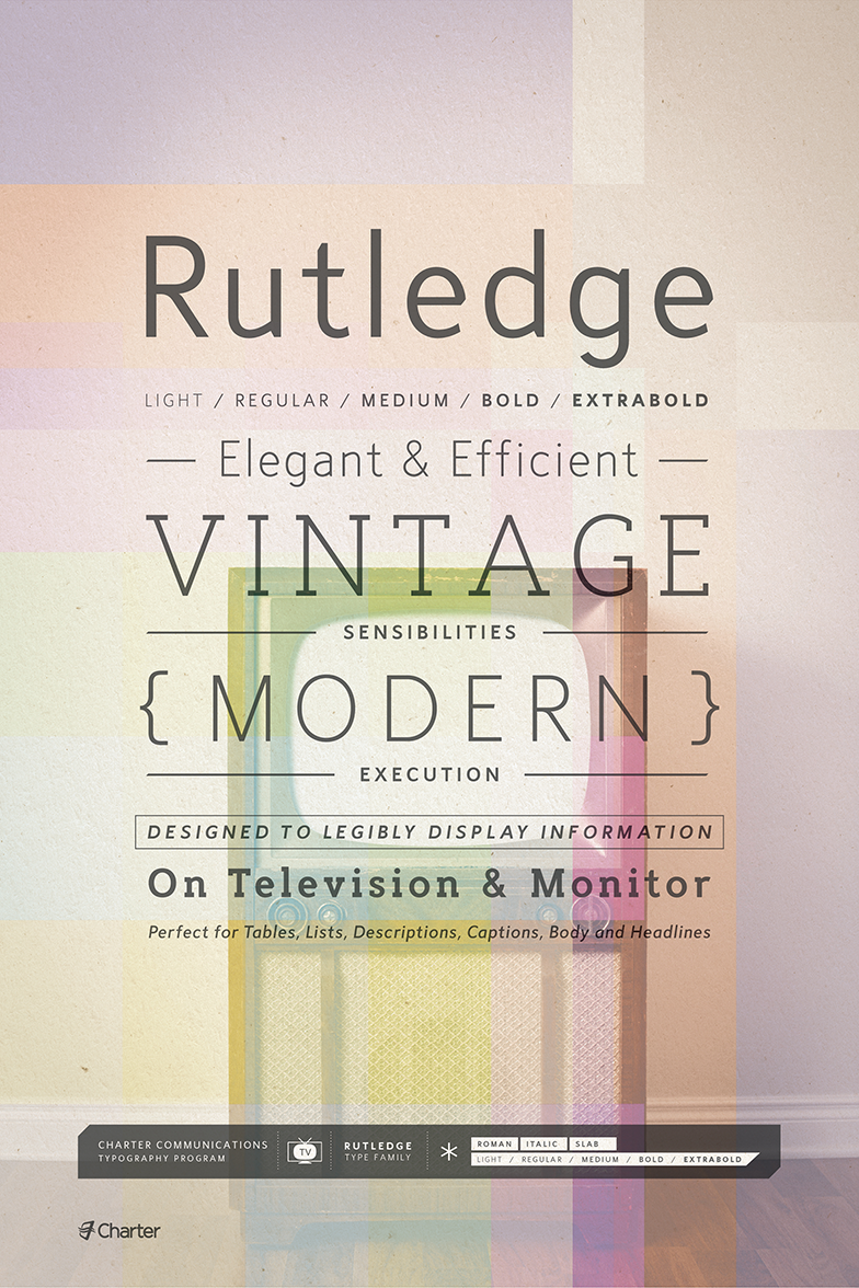
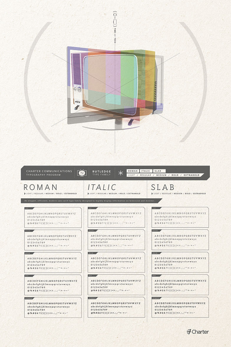
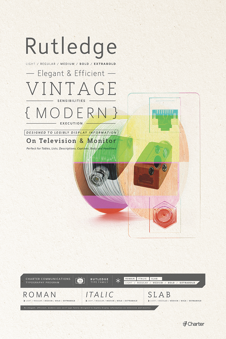
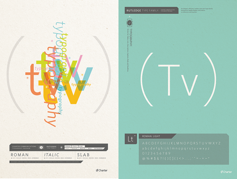
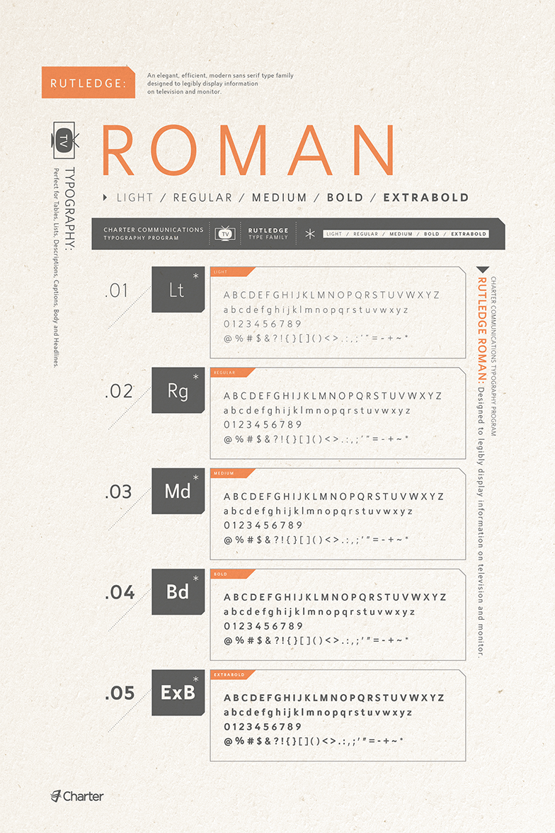
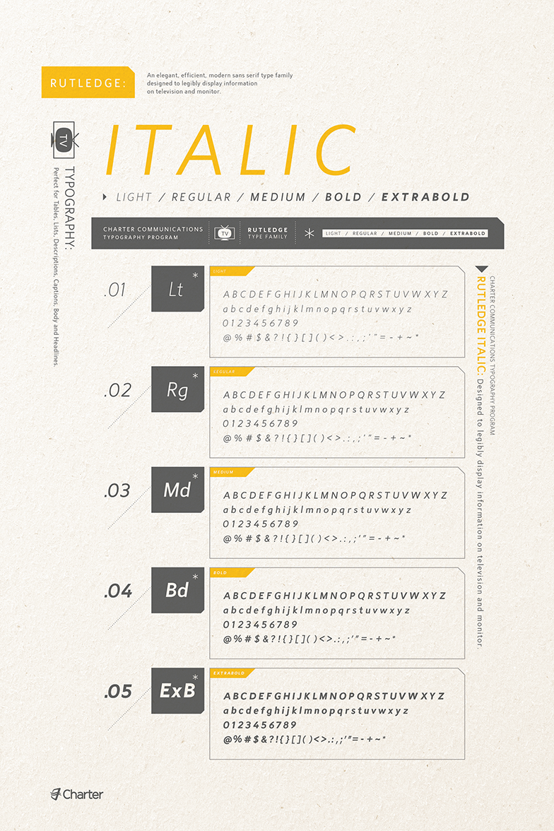
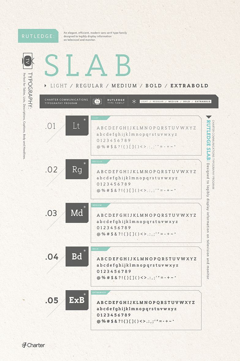
The typeface we designed and named Rutledge (after the CEO) combines a sense of traditional broadcast architecture and modern digital delivery. Our final delivery was a comprehensive type family with a wide range of weights and styles, each meticulously crafted to meet the diverse usage applications of Charter’s in-house design team. We designed a special sub-family that provided maximum readability for digital display through cable boxes and on mobile devices – a core aspect of what Charter provides.
PROJECT ELEMENTS:
- Design Strategy
- Typeface Design
- Digital Legibility Testing
- Creative Usage Guides
- Technical Documentation